Find a suitable parking slot in the area and book. It is hectic these days due to the limited parking slots. Users get annoyed during this whole parking experience, which becomes a real problem for parking managers. Therefore, we should look at this situation from users’ and managers’ perspectives. Here are the issues that I’ve identified. Parking spaces in city areas are very limited. Users will know if parking has vacant spots once they reach there. Many parking places use physical tokens or tickets that can be easily damaged or replaced. Most of the private parking spots don’t accept online payment. Most of the parking app doesn’t allow booking for multiple days to extend the duration. People may need to remember the area/slot where they have parked their vehicles.
DESIGN PROCESS
My client came up with a list of features he wanted to have on this application. But before diving in and bringing my solutions, I’ve decided to do some competitive research by checking some of the top parking finder apps in the app store. Here are the three main apps that I chose, Parknow, Park+, Easypark.
Takes a lot of steps to register, no proper search for parking, unclear if you will pay by minutes or by hours, not clear how the parking and paying process goes, only a few parking locations available, cumbersome user interface.by: Sayi Camara
I downloaded all three apps to examine them and see what they lack based on the user experience. In addition to learning from their mistakes, we should also see what they did, why they did it, how this app works, and what services they provide for a better experience. I found some excellent time-saving features, but most apps weren’t intuitive and didn’t seem like they brought the best solutions for their users’ needs. Also, here is some user feedback that I found interesting on those apps,
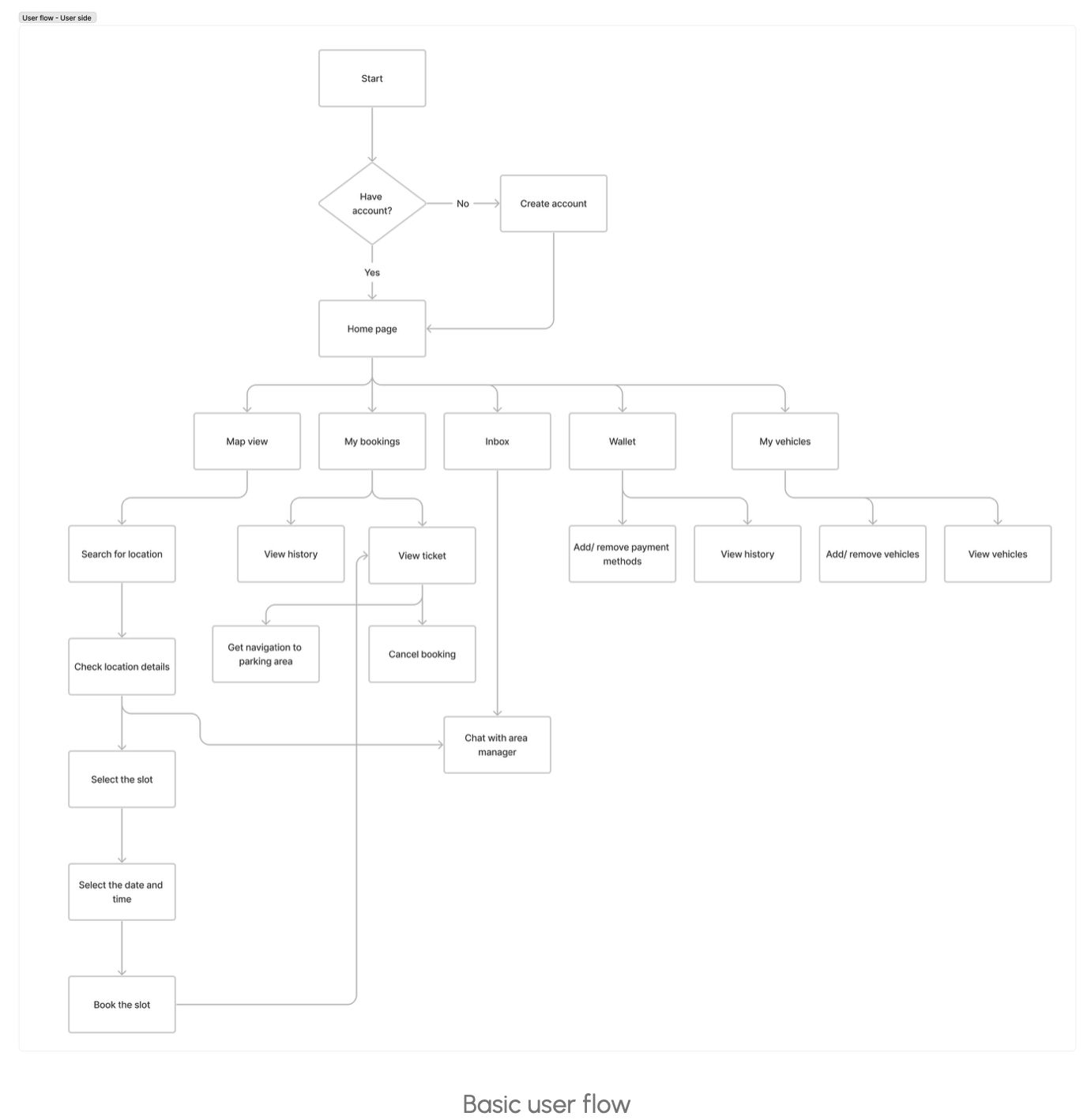
USER FLOW
I identified the user goals by looking at the competitor apps and based on the features list. I’ve validated every single user story with the team. The team wanted to be involved in as many tasks as possible so that everyone could better understand the project. I created the user flow while defining the user stories because it was the easiest way to handle both without spending too much time on each separately.
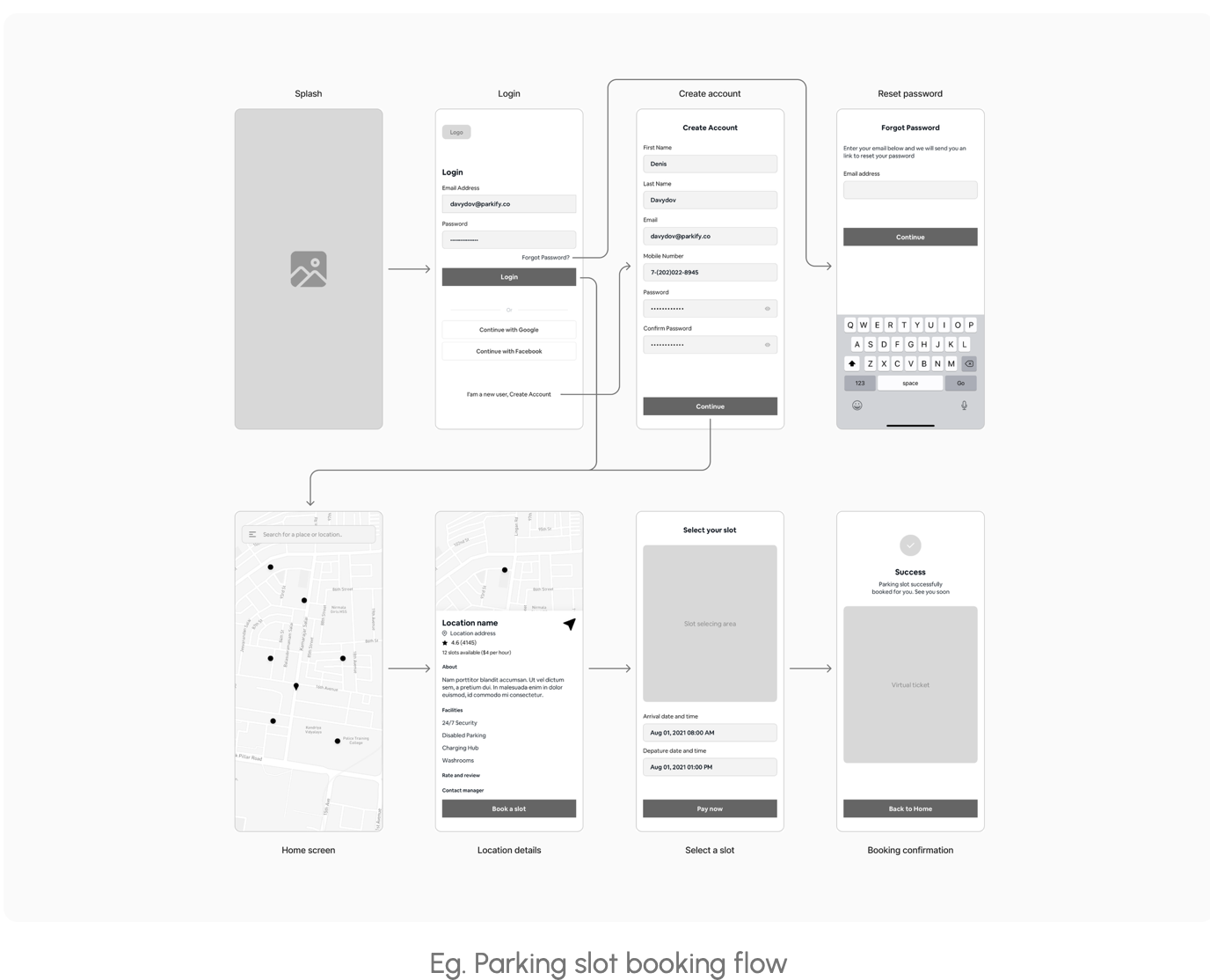
WIREFRAMES
I identified the user goals by looking at the competitor apps and based on the features list. I’ve validated every single user story with the team. The team wanted to be involved in as many tasks as possible so that everyone could better understand the project.
Comments(3)
Super and attractive wor.
Amazing work.
Just awesome ! Good job.